House Seven Design One Room Challenge
I don't even know where to begin. I am in utter shock and complete disbelief combined with a major case of slap happy at the moment that somehow this bathroom renovation is COMPLETE.
Literally just in the knick of time.
I have so many people to thank and so many fun pics to share with you, I don't know where to even begin. I guess we start at the beginning then. A HUGE thank you to Linda Weinstein for including me as a featured designer in this Spring's One Room Challenge! Truly an honor and indeed a challenge… And an additional big ol' shout out to the official media partner of the ORC, Better Homes & Gardens!
Now, let's bring on the before images again, shall we?
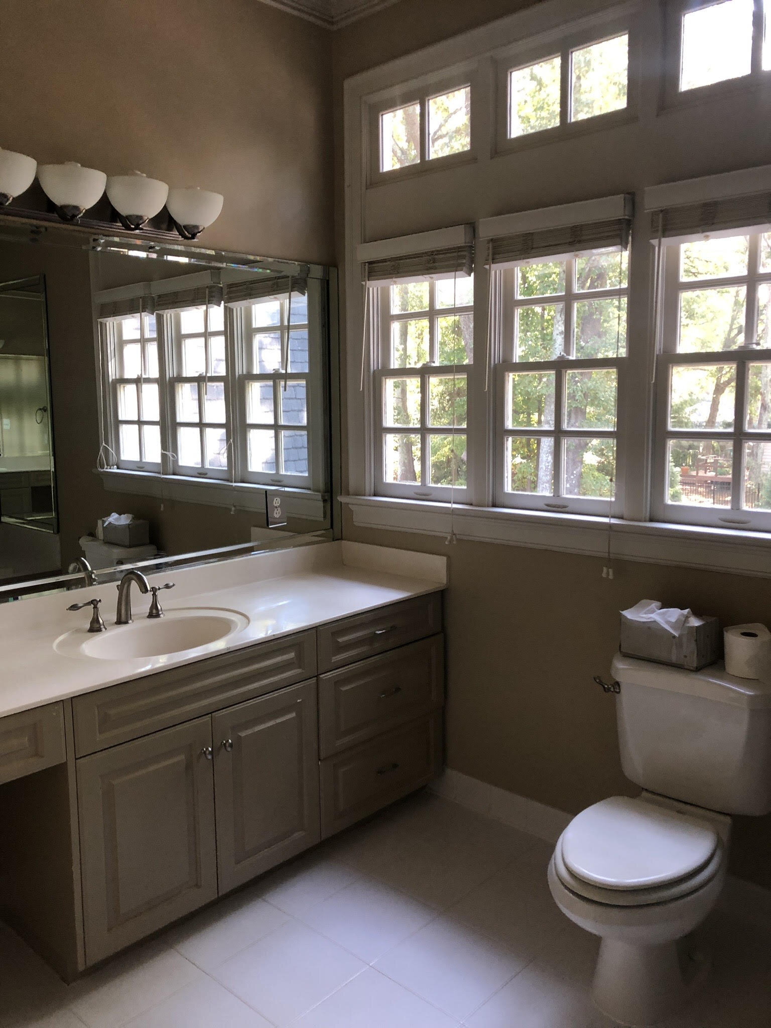
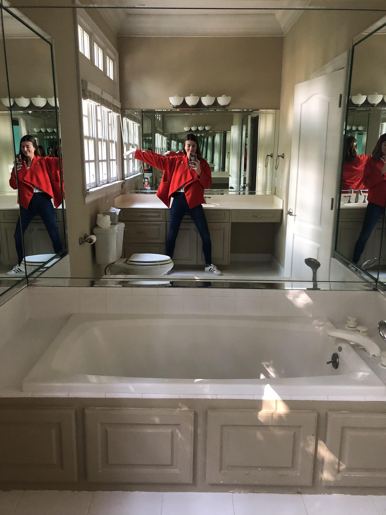
Beige, lots of mirrors. SO many mirrors. No shower, leaky tub. You get the gist. Now for the reveal….
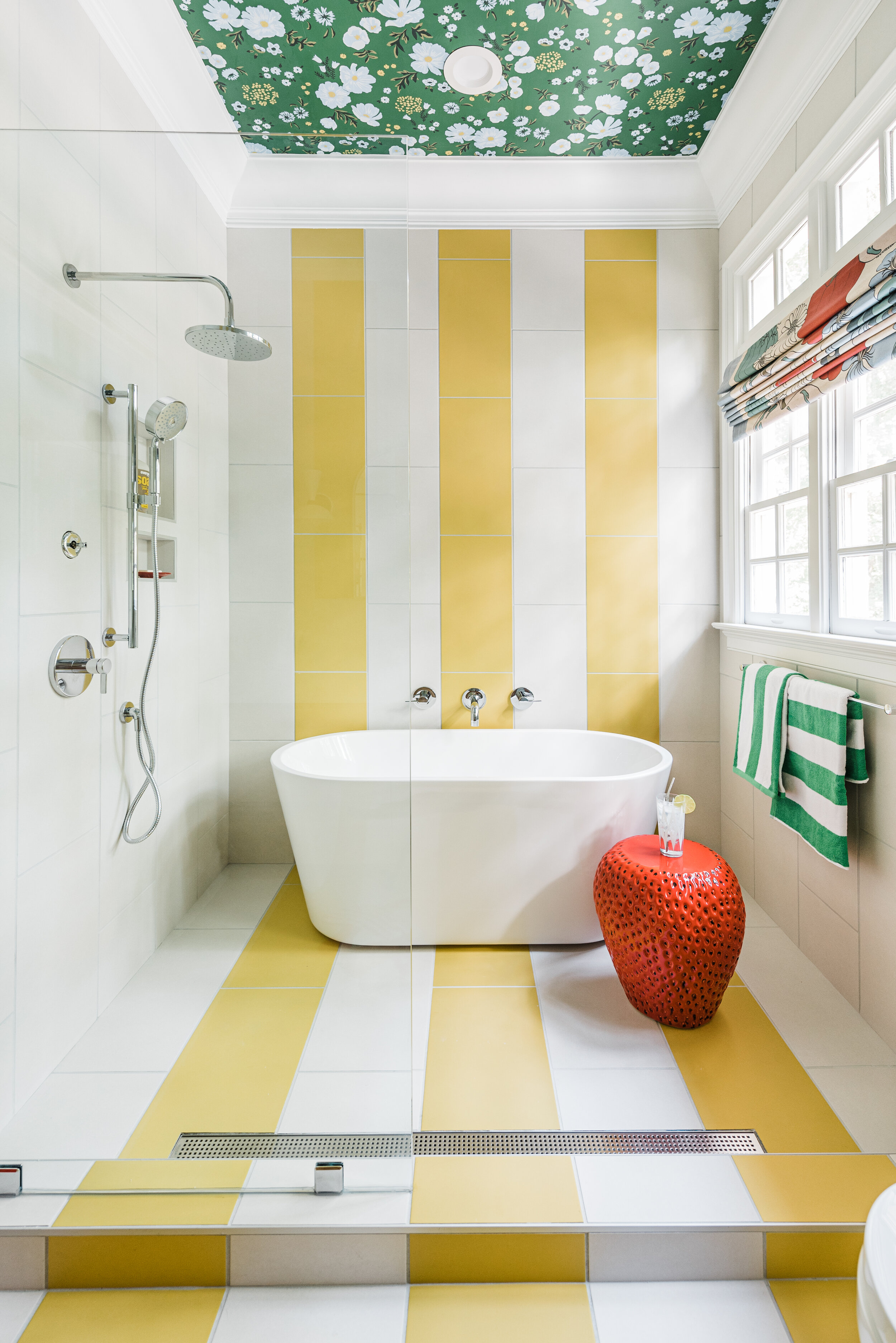
I may have just teared up a little. Pretty sure a tear escaped. I am just so happy with how my daughter's bathroom turned out. And more importantly, she is too. One can have a vision but without the right experts to help you execute it, it would never, ever happen. Sean Carlin of Sean Carlin Designs was my contractor for this space. His second time helping me to execute my vision for a One Room Challenge space in my home. His talent, his ability to not lose his cool (even when I was….) and his attention to detail is truly exceptional. Pretty sure there is nothing he cannot build, fix, figure out, envision and do.
You may have noticed that the layout of this room has been completely flipped. The side with the bathtub and shower used to be the vanity wall and vise versa. It was Sean's idea to flip the space giving us the additional room to built in a separate bathtub and shower in this "wet area" (yes that's the worst description for this side of the room ever but I can't seem to find a better term for it).
Yes, Sean. You were right. (eye roll) But truly thank you for pushing me in that direction.
Major thank you to Build by Ferguson who sponsored this beautiful tile moment from Daltile and all of our Kohler plumbing in this space. The foundational materials were key and having Build.com's team with me every step of the way helped bring this room to life. Their endless selections and exceptional customer service make every weighted decision a little easier.
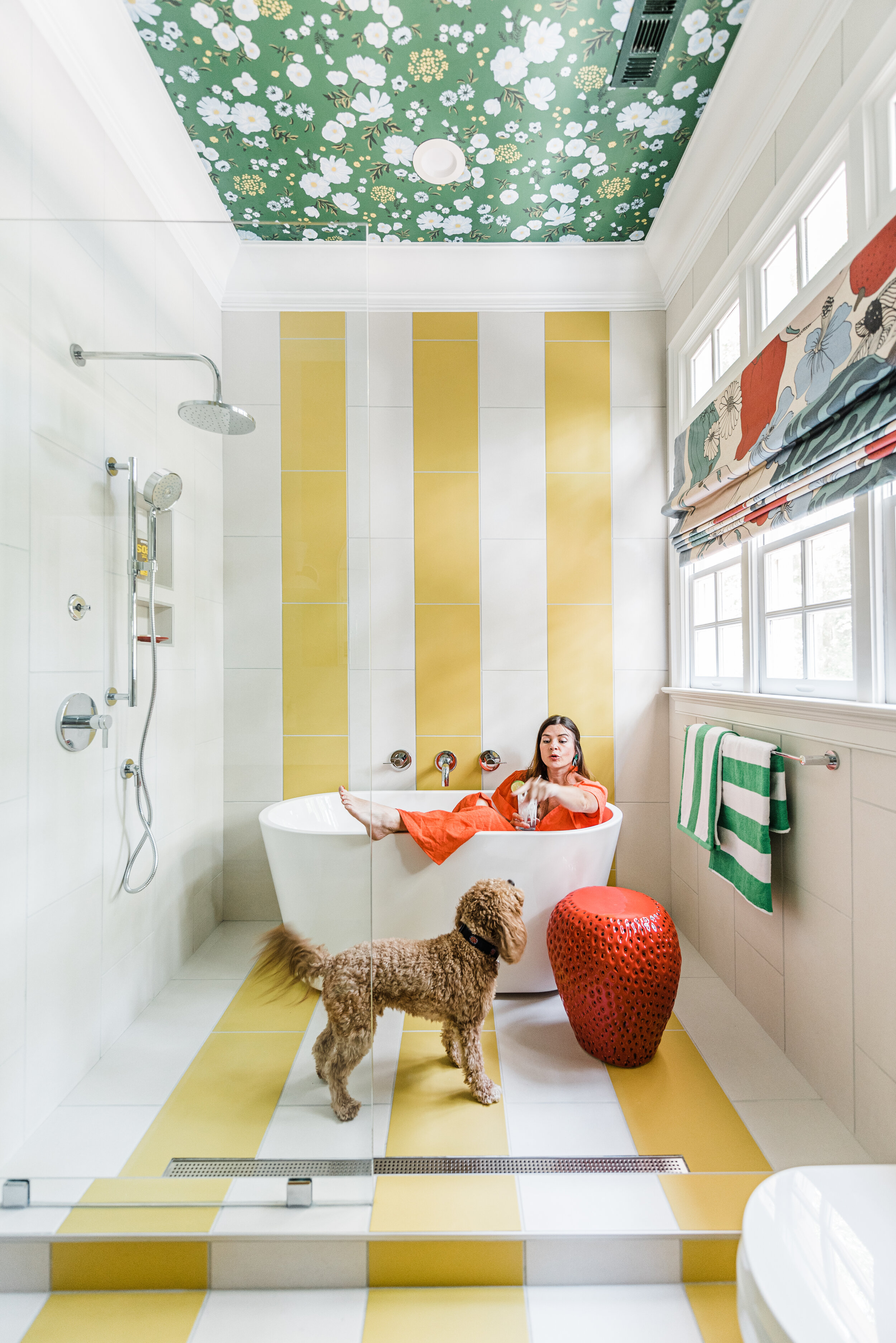
Daltile Volume 1.0 - 12 x 24 Smooth Cement Visual in Sonic White & Cheer Yellow
Kohler Purist Hand Shower Package and Rainhead
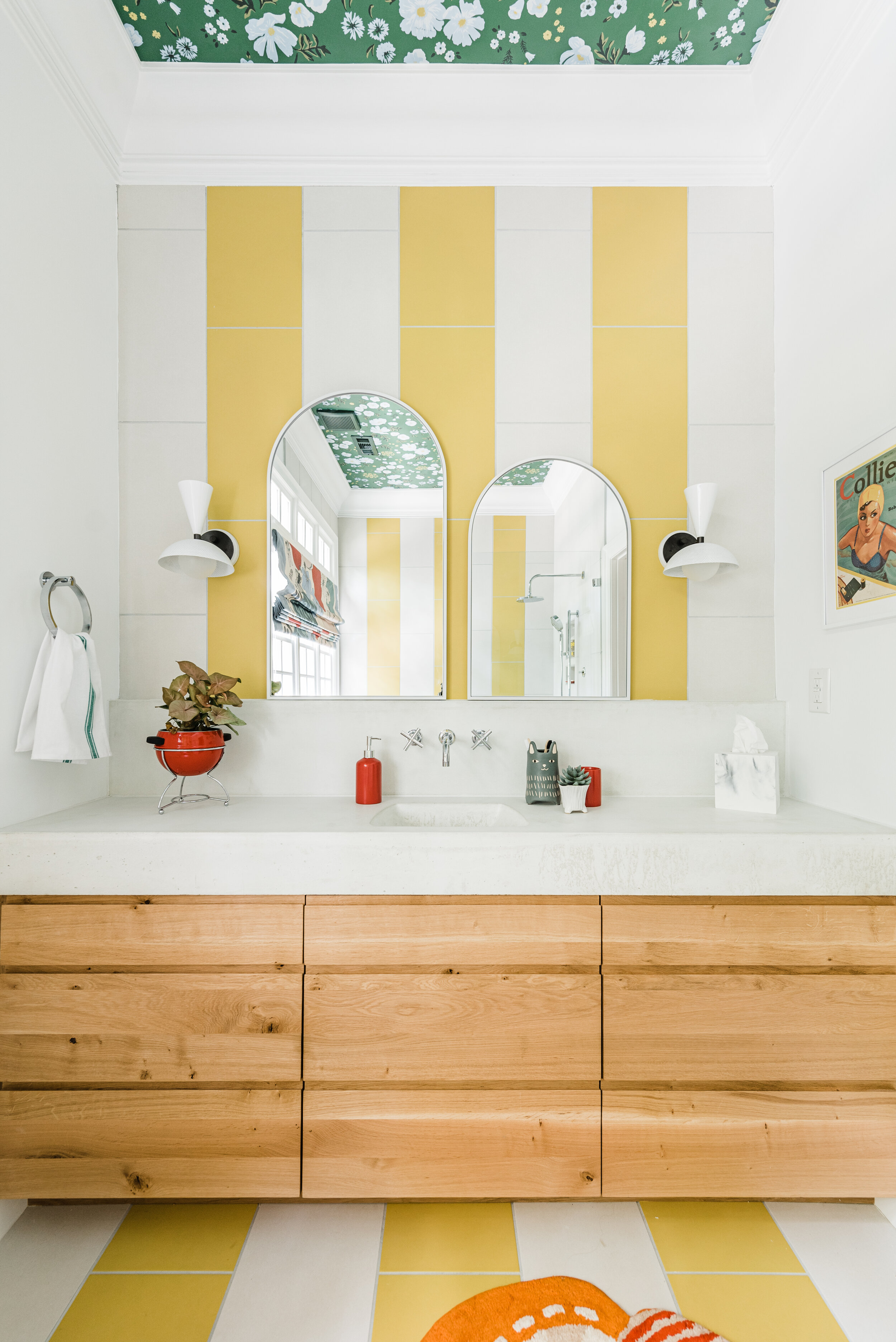
Now how about that other side of the room? This is where the bathtub USED to be. Sean built this custom vanity from European White Oak and a cement countertop from a custom mold he built to fit along the whole side of the wall (if he would have had it his way, you would have seen a toilet over here too. Sorry Sean, wasn't gonna let you win that one…), The warmth of the wood warms up the room and allows that graphic striped tile to shine. Build helped us out here again with this Kohler Purist Wide Spread Faucet in Polished Chrome to match the shower fixtures and it's a match made in heaven.
Speaking of heavenly, how GOOD are these Molto Wall Sconces from Blueprint Lighting?!! I have been drooling over their lighting for some time so I can't tell you how happy it makes me to have these gracing the vanity. The sconces can be installed pointing up or down but I love having the downcast lighting for this area.
I softened these hard lines by using two different sized arched mirrors that give the illusion of sitting on the ledge of that pretty concrete countertop and added some red styling pops for fun's sake.

Wall art by Margot McDaid. Towels from Amazon. Strawberry stool from Home Goods.
I was feeling pretty good about the main elements in this room but I was struggling over what do do for window treatments. While contemplating, Martha from Martha & Ash ( a local, custom drapery vendor) reached out and offered to help. Serendipity. This gave me an additional opportunity for pattern play by using Marimekko's Tahuri fabric in this beautiful custom roman shade they made me. I cannot recommend this mom and daughter team more. I am blown away with their generosity and their talent!! Massive gratitude.
Another very generous sponsor, Emtek, supplied ALL the hardware seen for this space. The finishing touches are all in those beautiful final details and Emtek made that process easy with all their options and finishes. They carry a HUGE variety of door hardware, bathroom accessories and cabinet hardware all custom assembled in their Southern California facilities.
To keep the hardware polished and modern, I opted to go with their paper holder, towel ring, towel bar and double hook all from Modern Brass collection in polished chrome. I also really appreciate the additional option of being able to choose a complimentary rosette. I opted for the small disc rosette for this bathroom and I love the way the circular rosette contrasts against some of the hard, linear lines of the room.
And as a final but important touch, we truly needed some new door hardware as the old doorknob was dated. I am obsessed with Emtek's door hard selection!! The porcelain knobs feel so old school yet modern with the polished chrome backplate and is the perfect compliment to this vintage inspired bathroom. I choose an Ice White porcelain knob with the polished chrome rectangular rosette. And now I need to change every knob in my house to match this beauty!

Cascade Meadow Wallpaper in Juniper from Schoolhouse & Hygge and West
Last but not least, it's important to remember that fifth wall. The ceiling. Schoolhouse and Hygge & West collaborated on this vintage inspired collection and it sure made for a magical moment in this space. The Cascade Meadow print in Juniper is an unexpected touch that gives this bathroom an extra dose of whimsy and charm. I love the way this pattern brings the outdoors in and add that extra dose of color I can't seem to get enough of!


House Seven Design One Room Challenge
Source: https://www.homeecop.com/the-buzz/spring-2021-one-room-challenge-bathroom-renovation-the-reveal
0 Response to "House Seven Design One Room Challenge"
Post a Comment